Free Food to Go
Making quality free food more accessible and convenient
The Context
Free food can be hard to access
There is currently no centralized way to find food shelves and order food from them in the Twin Cities.
Each local food shelf operates separately and differently, and it’s often difficult to find relevant information about them quickly. Curbside pick-up and delivery options are also rare.
I wanted to explore whether a website to order food for pick up or delivery from local food shelves would meet a local community need, making healthy food more accessible and convenient for community members.
In doing user research, I found that users’ main objectives were to find nearby food shelves, assess whether those food shelves would meet their needs, and get food quickly and conveniently. I then designed and tested a prototype of a website that aimed to meet these basic needs, giving local food shelf customers a more convenient, empowering pathway to accessing free food.
Role
UX Researcher & Designer
Dates
May 20 - May 30, 2024
Methods & Tools
User research, directed storytelling, affinity diagramming, wireframing, interactive prototyping, usability testing, think-aloud evaluations, Figma, Zoom
The Problem
Accessing food shelves is surprisingly complicated
In my previous role as a caseworker, I found myself constantly searching Google Maps, search engines, and resource listings to find the best, most accessible, quality food shelves to share with the folks I worked with. But finding options that were open, accessible without a car, and didn’t have restrictive eligibility requirements, etc., was a complex task–one that too often led folks to give up and just go without food instead.
Next available appointment:
The 3rd Tuesday of next month, in a church basement two cities away, so you’ll need to get a ride from someone…also, they’ll only have canned tomato soup and black beans, and you’ll need to bring an ID and your tax returns from the last two years as proof of income
I wanted to design a tool that would make getting food from food shelves a convenient, empowering process rather than a dehumanizing, time-consuming chore.
The Users
Exploring Users’ Goals & Experiences
To better understand users’ goals in accessing food shelves, I conducted three interviews with individuals who had experience using food shelves. Utilizing directed storytelling to allow users to focus on their own values and pain points, I found they all shared three main objectives:
Finding nearby food shelves
Getting information about the food shelves to determine if they met individuals’ needs
Obtaining quality food quickly and easily
Users’ stories brought up common themes
Location & transportation
Is this food shelf nearby? Can I get there? Or do they deliver?
Eligibility & relevance
Is this food shelf meant for people like me? What documents will I need? Are there limitations?Dignity vs. shame
Will this be a dehumanizing experience that makes me feel “othered?”Quality & choice
Will they have quality, unexpired food that I can and want to eat? Will I be able to pick what food I get?Convenience & accessibility
Will this food shelf be easy to get food from? Will their hours, language, processes, etc. match my needs?Privacy & safety
What information will I have to share? Where will they share this information?
“Ordering food online is fun!
- “B”
“I need food from the food shelf, but I don’t go because I can’t carry the food. The bags are so heavy…but the option of delivery is perfect.”
- “A” (translated from Spanish)
“I would love to be ordering stuff in advance online…it ends up being a lot of me dangling into a big freezer bin…checking the expiration dates on stuff…digging through bins of rotten food is just so much less humanizing than Instacart.”
- “T”
“What if I see someone I know?”
- “B”
The Design
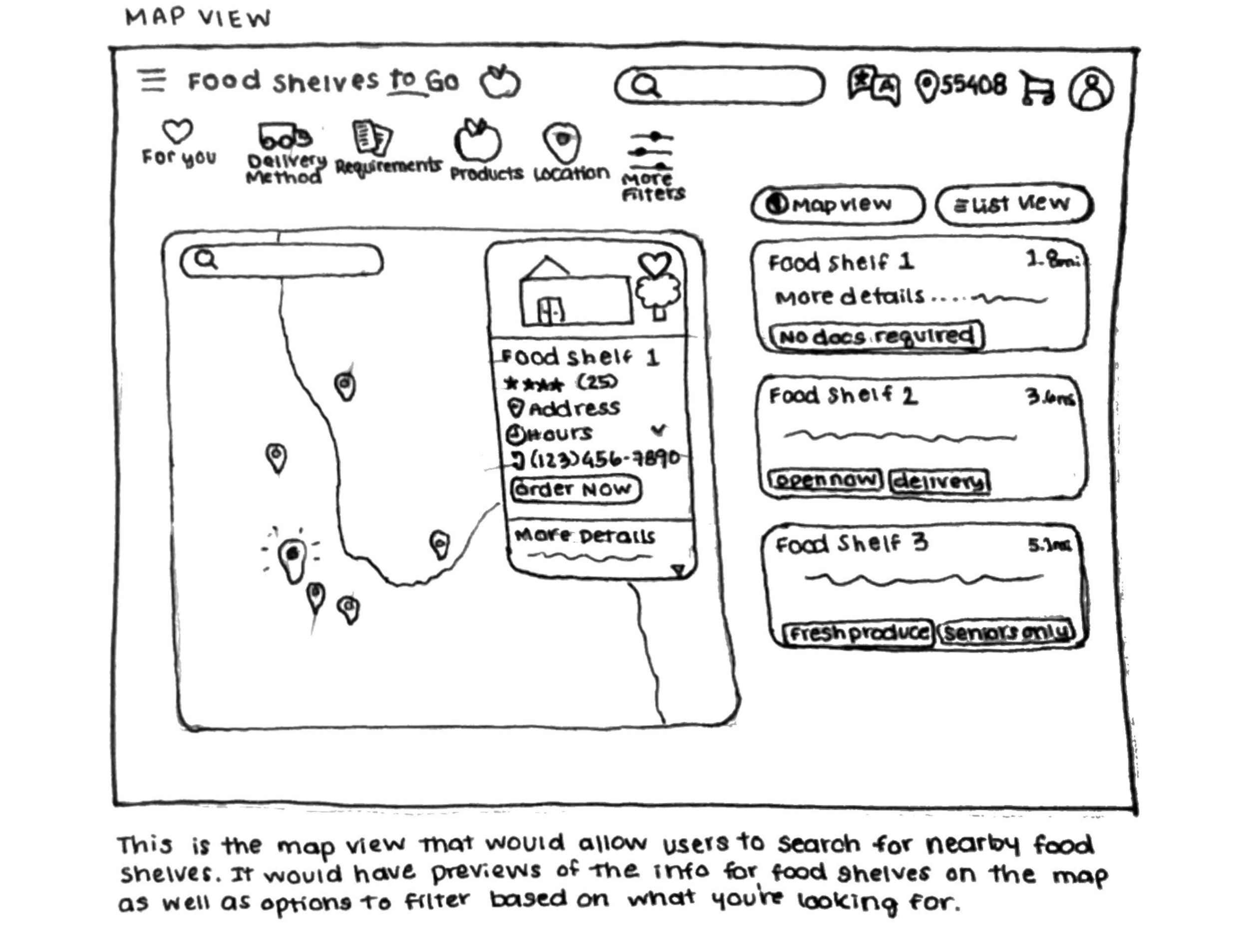
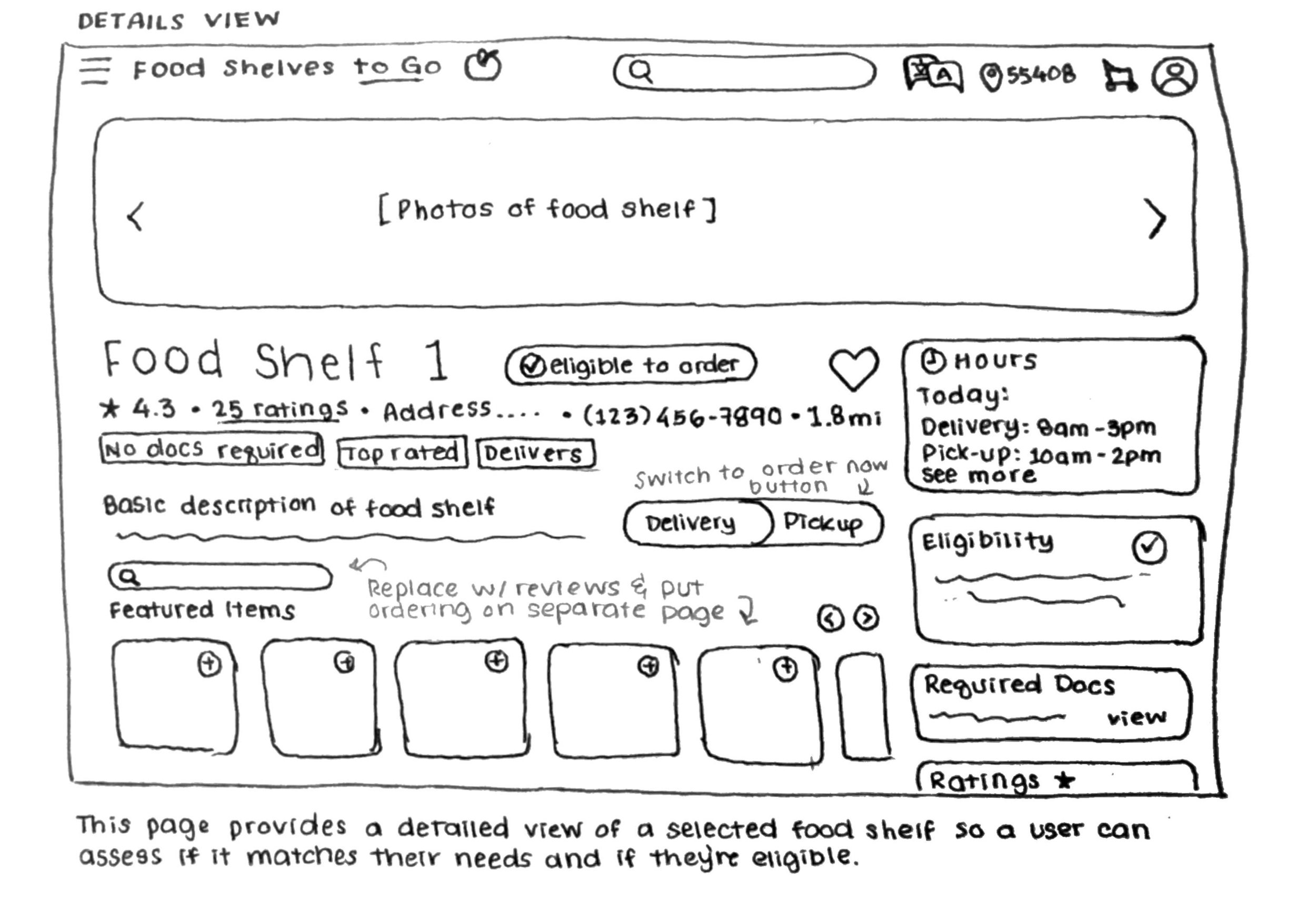
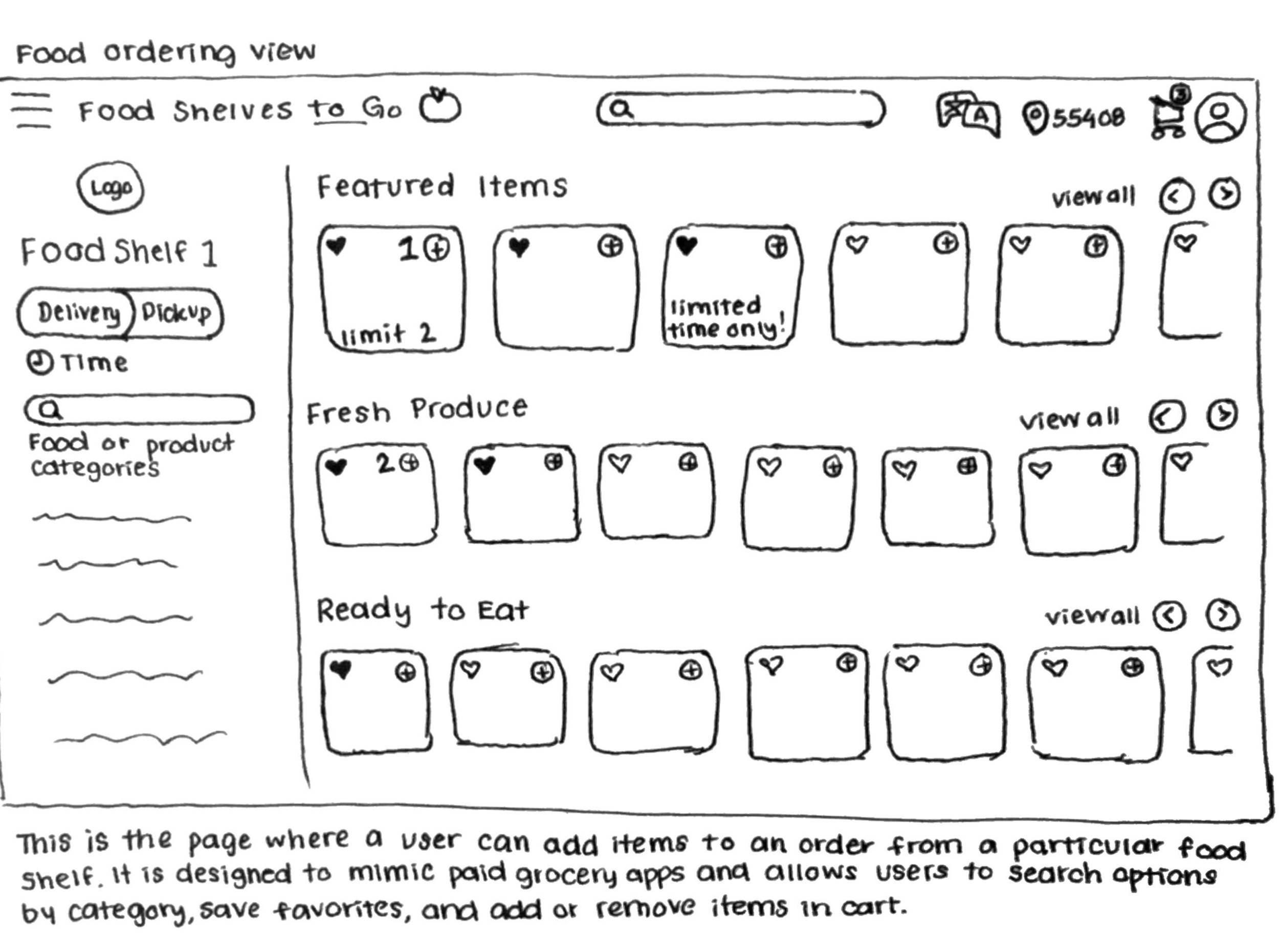
In order to make sure the website centered on users’ basic goals, I started with three sketched wireframes of the key pages that aligned with users’ three main objectives. After working through an outline for the site, I then built these out into digital wireframes and interactive prototypes, filling in the missing pages in users’ ideal pathway to finding and ordering food.
Sketching out a framework
Tapping into existing mental models
Given that there is no existing tool for ordering food from food shelves in the Twin Cities, I knew that users would not have a pre-existing framework for what to expect from the website—especially given that food shelf users may include those with limited access to and experience with technology and e-commerce platforms.
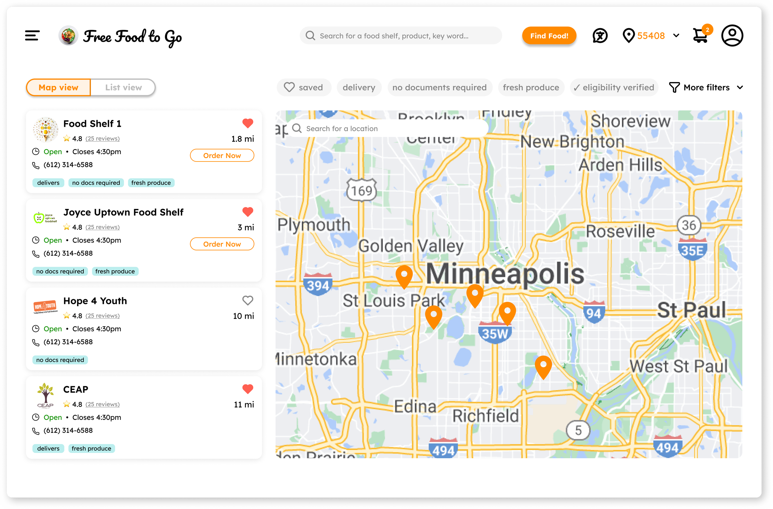
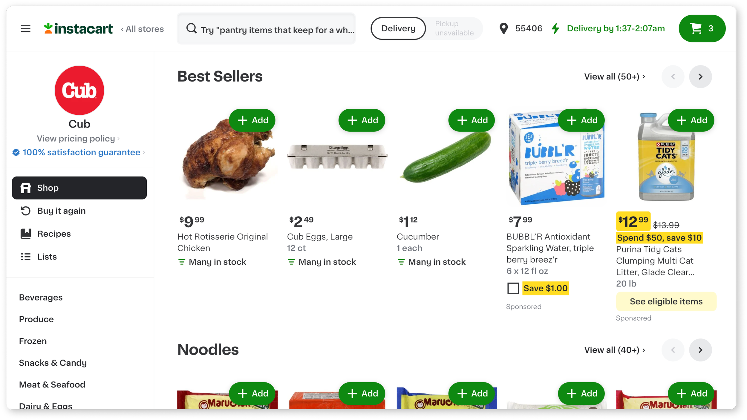
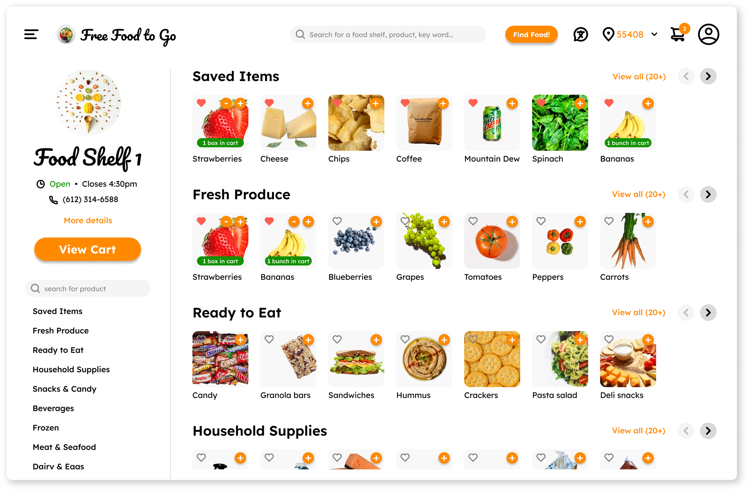
So in these designs, I intentionally mirrored websites that might be familiar to users in order to align with their existing mental models.
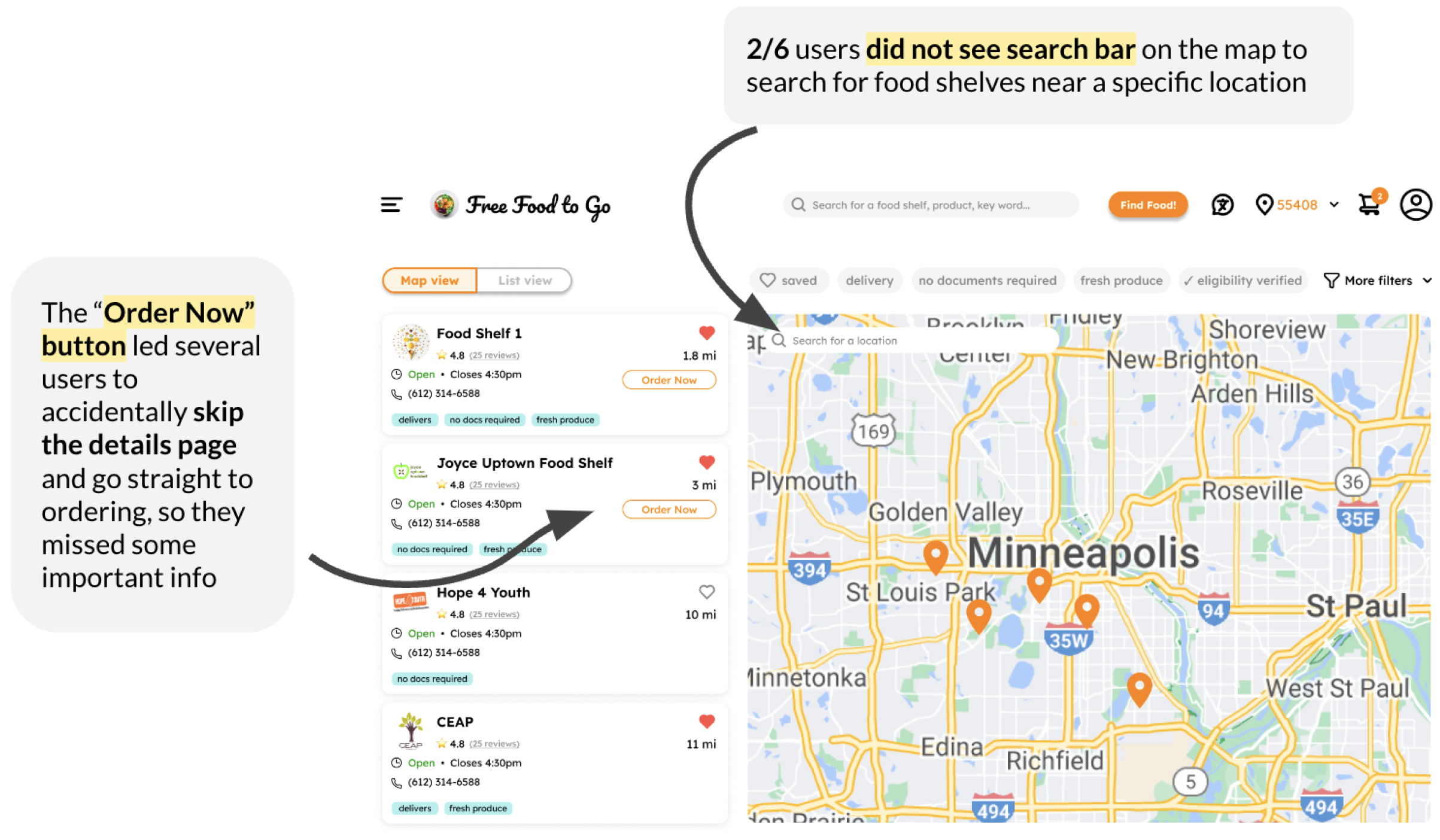
The map view mirrors Google Maps in order to make navigating the map and scrolling through nearby food shelves feel more approachable.
I designed the food ordering page to mimic Instacart and DoorDash, not just for familiarity, but also to invoke their associated feelings of privilege, dignity, and desirability, which are so often lacking in food shelf experiences.
User Testing
Would this tool actually support community members in accessing free food?
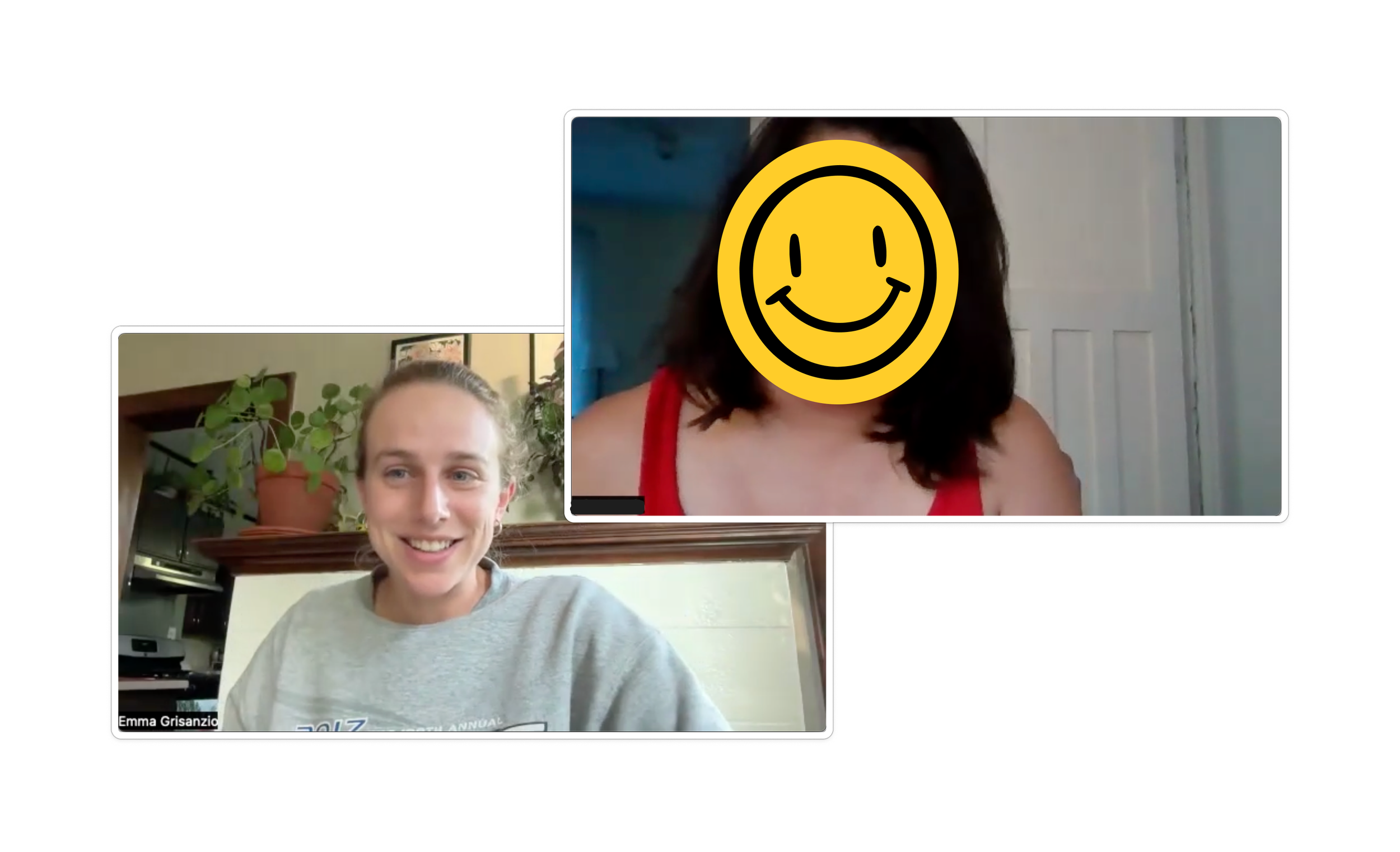
In order to test the effectiveness of my design in meeting users’ objectives, I conducted think-aloud evaluations with six individuals over Zoom. I chose this approach to get a better sense of what users were looking for as they moved through the site and what aspects of the design became barriers for them. I also wanted to hear how the site made them feel to ensure that it was an empowering and positive experience for them—counter to their previous experience with food shelves.
I asked participants to narrate their process as they showed how they would navigate the prototype website to find a food shelf that fits their needs and how they would then order some food from there for delivery.
Evaluation goals
Assess how well the website aligns with users’ basic goals of finding food shelves that meet their needs and ordering food from them
Identify barriers or points of confusion for users in navigating the website to meet their goals
Examine the desirability of the website and its effectiveness in creating an inviting, empowering experience for users
An informative sample of possible users
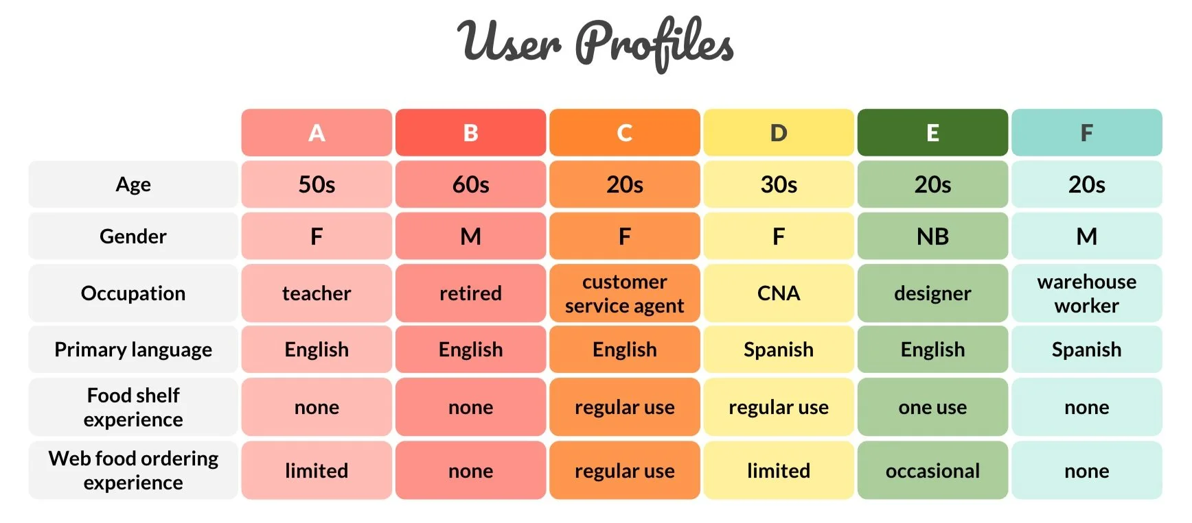
I recruited participants with varied backgrounds for user testing. I was looking in particular for a range of experience with accessing food shelves and using food ordering websites. I also intentionally included two individuals whose primary language was not English to assess how accessible the site would be for non-native English speakers.
To test how the site would meet users’ three main objectives, I focused on a pathway that would allow them to find a food shelf, see details about that food shelf to assess if it would meet their needs, and place an order for delivery from that food shelf.
Findings
Participants found the site easy to use
“super easy” | “very functional” | “organized” | “very usable”
In addition to collecting qualitative data from users’ narrated navigation of the website, I also gathered quantitative responses from users specifically relating to the initial user objectives of the site.
Some design features could be improved for increased accessibility
While users mostly navigated the site without issues, I observed and noted some pain points that could be improved to enhance their experience. There were a few places where they couldn’t find a minor feature or expected buttons in different places. In a couple cases, shortcuts that users explicitly liked caused them to miss potentially relevant information on their first run-through of the site. So I determined that cutting down on some of those otherwise useful buttons and shortcuts could minimize confusion and clutter.
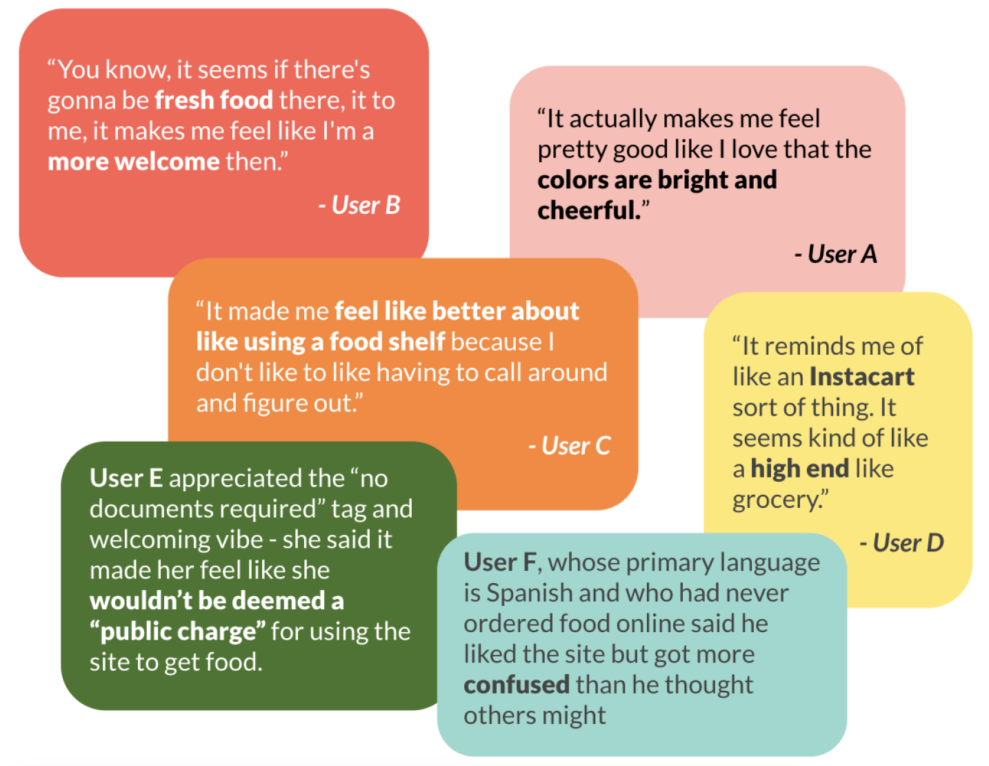
Users loved the colors and overall design, finding the site welcoming and empowering
Upon opening the website, five of the six participants immediately commented that they liked the colors. They also loved the focus on fresh, quality food. These factors combined to create a comfortable, enjoyable environment that users explicitly pointed out to be in contrast with their previous experiences with and expectations of food shelves.
Based on their feedback, I determined that the overall design of the website was effectively improving users’ experience of accessing free food.
Recommendations for an improved experience
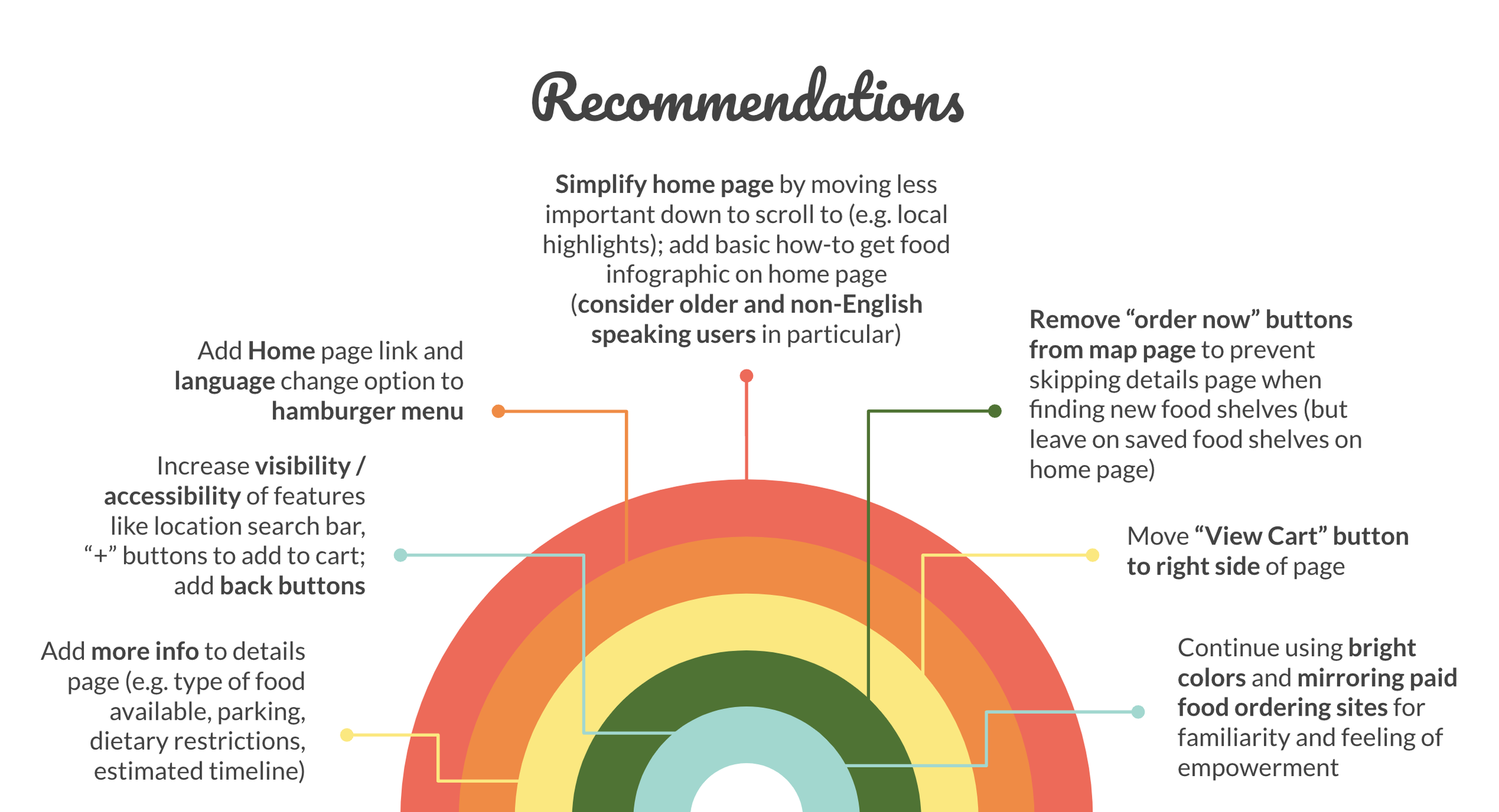
After completing user testing and synthesizing the main ideas, I put together a findings a recommendations report to outline suggested changes to the site.
In regards to the initial evaluation goals, I found:
The site effectively met users’ primary objectives of finding food shelves, getting information to meet their specific needs, and ordering food
While users reported that the site was easy to use, I outlined features that could be changed to improve user experience
The colors, structure, and language of the website successfully crafted a welcoming, empowering experience for users, who all said they would want to use the site and recommend it to others
Next Steps
Community members in need of free food deserve a humanizing way to access it
Given participants’ enthusiastic responses in my initial research and in user testing, there is clearly an interest in a tool like Free Food to Go.
Accessing free, quality food in the Twin Cities is often difficult and dehumanizing, and finding a way to transform this process into a desirable, empowering experience would be a game changer for so many members of the community.
From my own experience trying to connect folks to free food resources, I know there is no shortage of free food in the area—just a gap in access. So I would be excited for the opportunity to further develop this tool as a means of bridging this gap.
“10/5 would use. They need to make it real. They need to make this app.”
- User C
Exploring ways to build on the initial design
User testing revealed that the prototype is on the right track to meeting users’ needs. So by fixing some of the pain points, the site could lead to a workable tool.
Beyond the initial recommended changes, I would want to explore options to make the site more accessible for those with limited access to and experience with technology. I would also want to find ways to make it more user friendly for community members who do not speak English, including building out a more robust site translation option.
A major priority for future development would be creating an app version of the tool, since many folks accessing food shelves do not have access to computers, and web apps present significant limitations on phones. An app would be more accessible as well as provide more opportunities for useful, relevant features such as mobile notifications, real-time location, inter-app connectivity, and offline modes.
An opportunity to change the narrative
There are certainly plenty of unanswered questions and assumptions in this initial design, such as…
Who would be delivering the food? Would this be volunteer driven, and if so, could a volunteer system be modeled after paid delivery tools like Instacart, Shipt, DoorDash, etc.?
Would nonprofits running food shelves have the bandwidth to maintain a basic, up-to-date inventory to allow for online orders?
Who would maintain the site—would that be up to individual food shelves or a separate organization running the site?
Who would fund the development and upkeep of a tool like this?
But there is clearly a need for a better way to access free food, so with further development, I would hope that this initial design and research could at least open the door to further exploration of new, human-centered, and empowering models and tools for local food access.

