Mau Loa Sweets
Evaluating the usability of a website for a local business dedicated to making edible works of art
The Context
Mau Loa Sweets has perfected its cookies and is looking to improve its website.
Based in Andover, MN, Mau Loa Sweets is a home bakery business that specializes in custom-decorated cookies and cookie decorating classes. Kristin, the owner, baker, and artist for the business, reached out to Prime Academy to assess and improve the usability of her website, as she is in the process of redesigning the site.
To work toward this goal, I completed a heuristic analysis of the site and collaborated with a team of two other UX researchers to conduct usability testing.
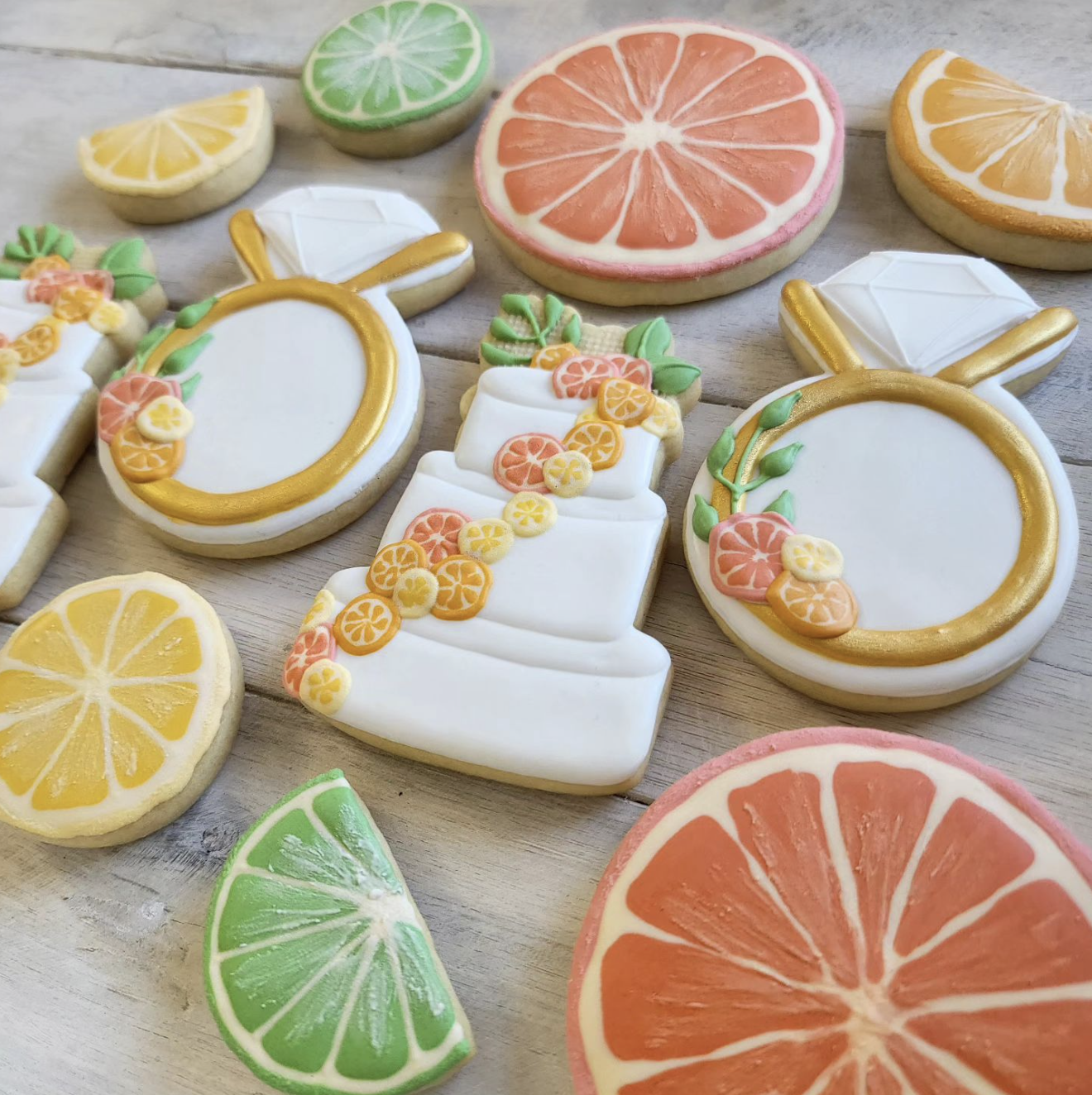
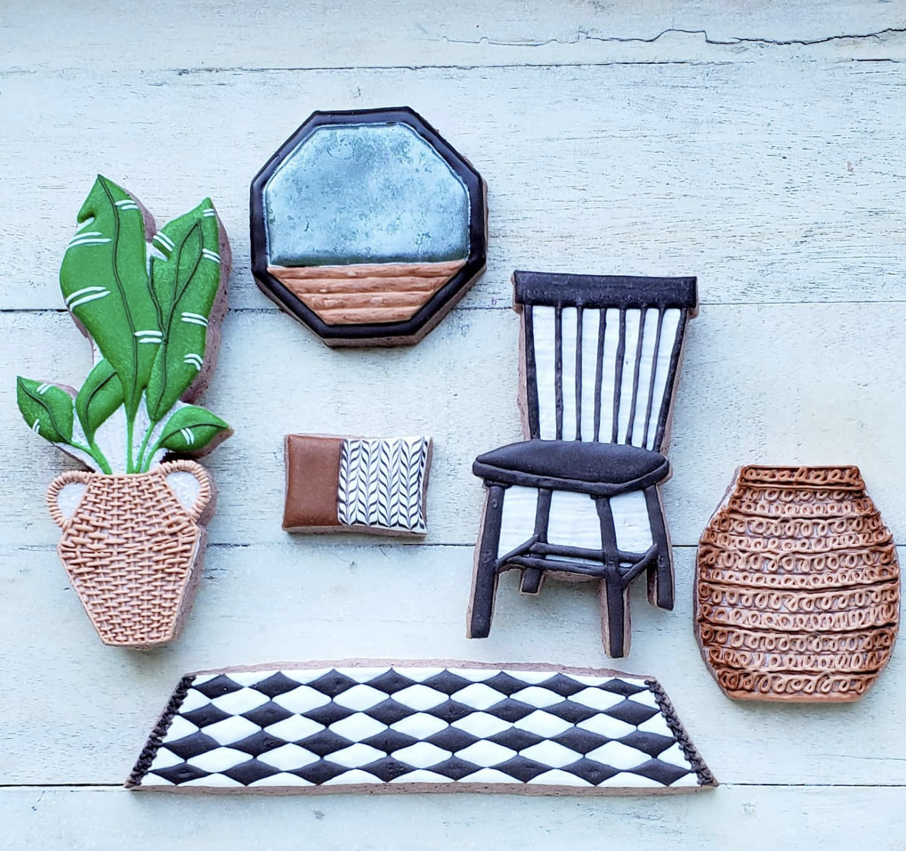
A sample of Mau Loa Sweets’ amazing, custom-decorated cookies (Instagram)
After synthesizing the data from our research, I found that while users were universally impressed by the cookies and interested in purchasing Mau Loa Sweets’ products, they were deterred by some key usability issues on the website. I put together a findings and recommendations report and a digital prototype of one of the pages of the site to provide direction for Kristin to address these usability issues and make sure her website is as much a positive draw for her customers as her products are.
Role
UX Researcher & Designer
Dates
June 10 - 16, 2024
Methods & Tools
Heuristic evaluation, user testing, affinity diagramming, digital prototyping, Figma, Zoom
The Problem
Mau Loa Sweets’ cookies are stunning works of art, and the business needs a high-quality website to match
As Kristin is thinking through the redesign of her website, she wants to focus on improving the site’s usability for the following goals:
Attracting and informing potential customers
Encouraging customer engagement through custom cookie orders, holiday pre-sales, and sign-ups for cookie decorating classes
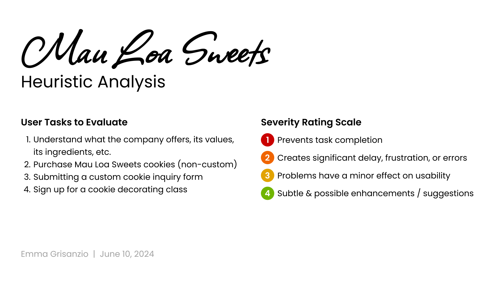
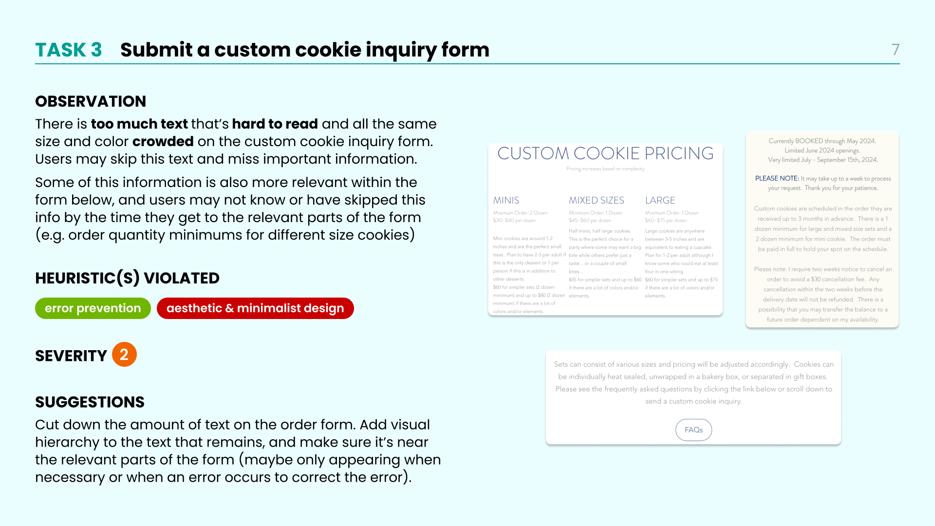
To get an initial idea of the the usability issues on the Mau Loa website, I completed a heuristic analysis (see below) based on 4 key user tasks:
Understand what the company offers, its values, its ingredients, etc.
Purchase Mau Loa Sweets cookies (non-custom)
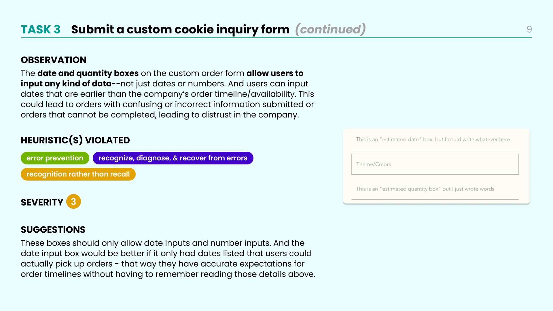
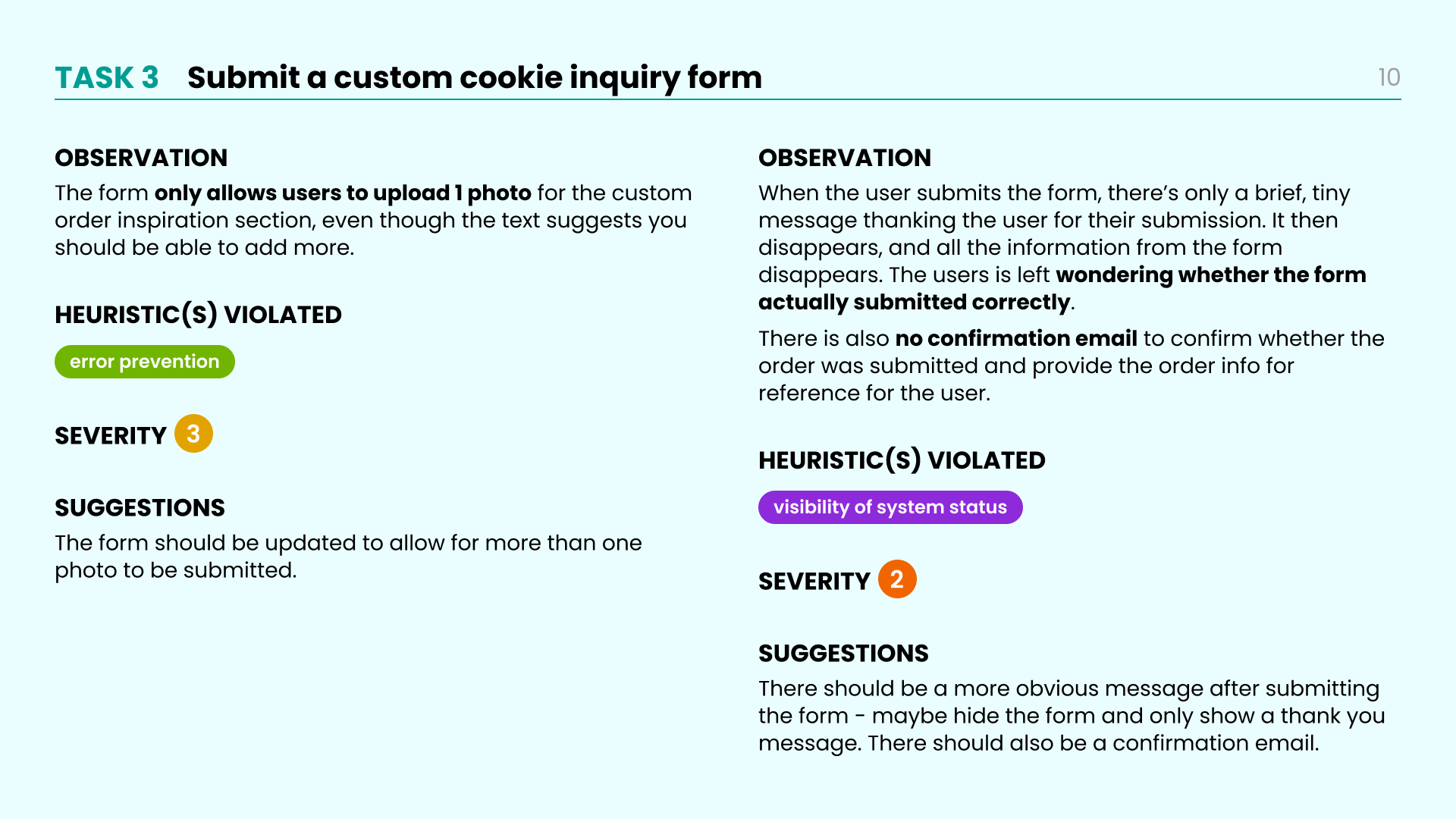
Submit a custom cookie inquiry form
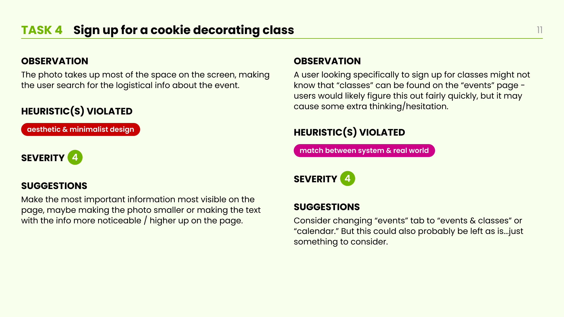
Sign up for a cookie decorating class
Identifying initial usability issues
Some heuristics violated across multiple tasks included:
Consistency and standards - the website’s layout and user flows didn’t fully align with standard website and form design
Aesthetic and minimalist design - there were several pages with large amounts of difficult-to-read text that made these pages less accessible and approachable
User Testing
Mau Loa Sweets’ website caters to 3 main types of users
Primary users: custom order clients - event organizers looking to add a thoughtful, creative element to their event with customized treats
Class attendees - creative individuals who want to learn to decorate their own cookies
Pre-order & pop-up event customers - folks hoping to purchase sweet treats, but less attached to it being a personal experience of collaborating with the baker
To assess the usability of the website for these identified key users, my team of 2 other UX researchers and I conducted user testing over Zoom with 8 individuals, all of whom had experience ordering products online and were familiar with custom baked goods.
We asked users to complete the same 4 tasks I had considered for my heuristic analysis: 1. understanding the company’s products / services / values, 2. purchasing non-custom cookies, 3. inquiring about custom cookies, and 4. signing up for a class.
Understanding users’ experience
Findings & Recommendations
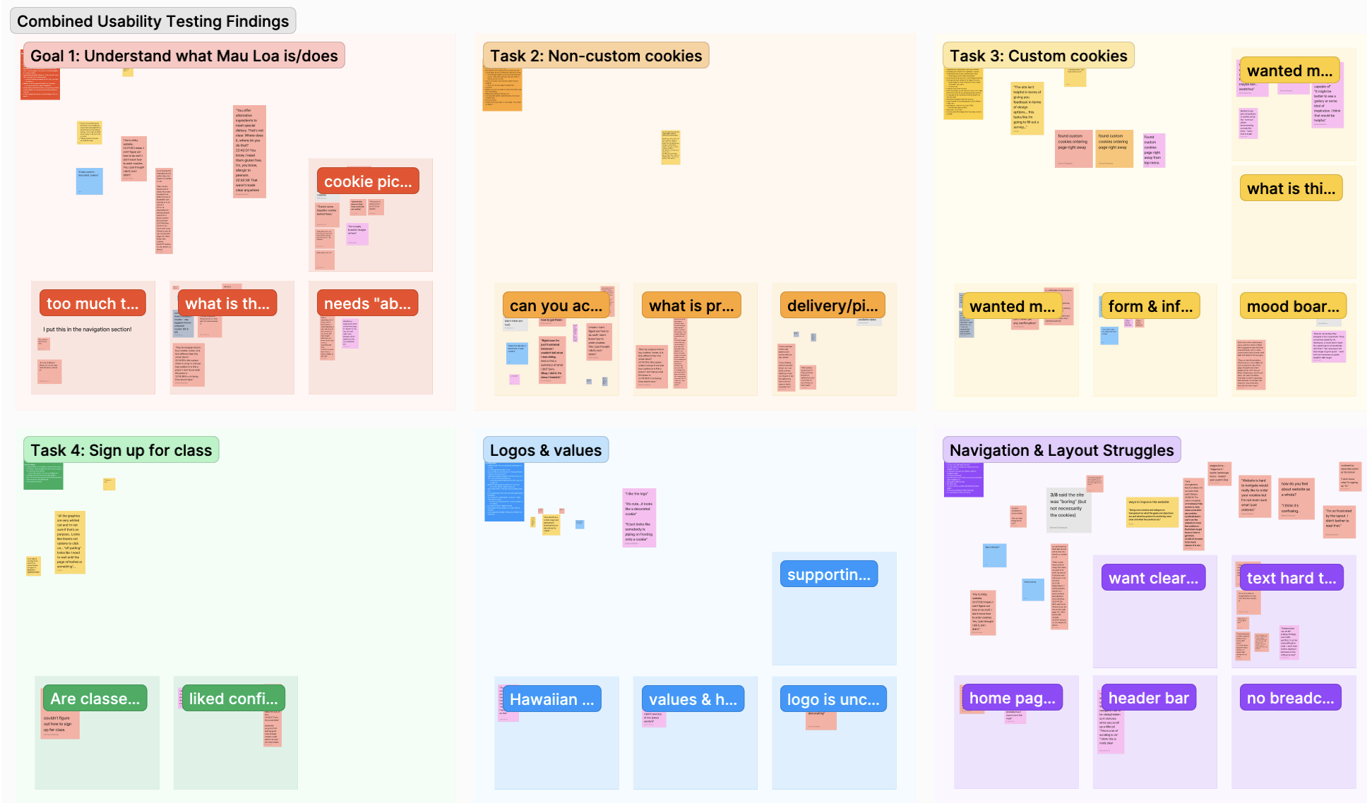
Our team’s affinity diagramming process after completing user testing
Users completing assigned tasks often found themselves “confused” and “frustrated” along the way
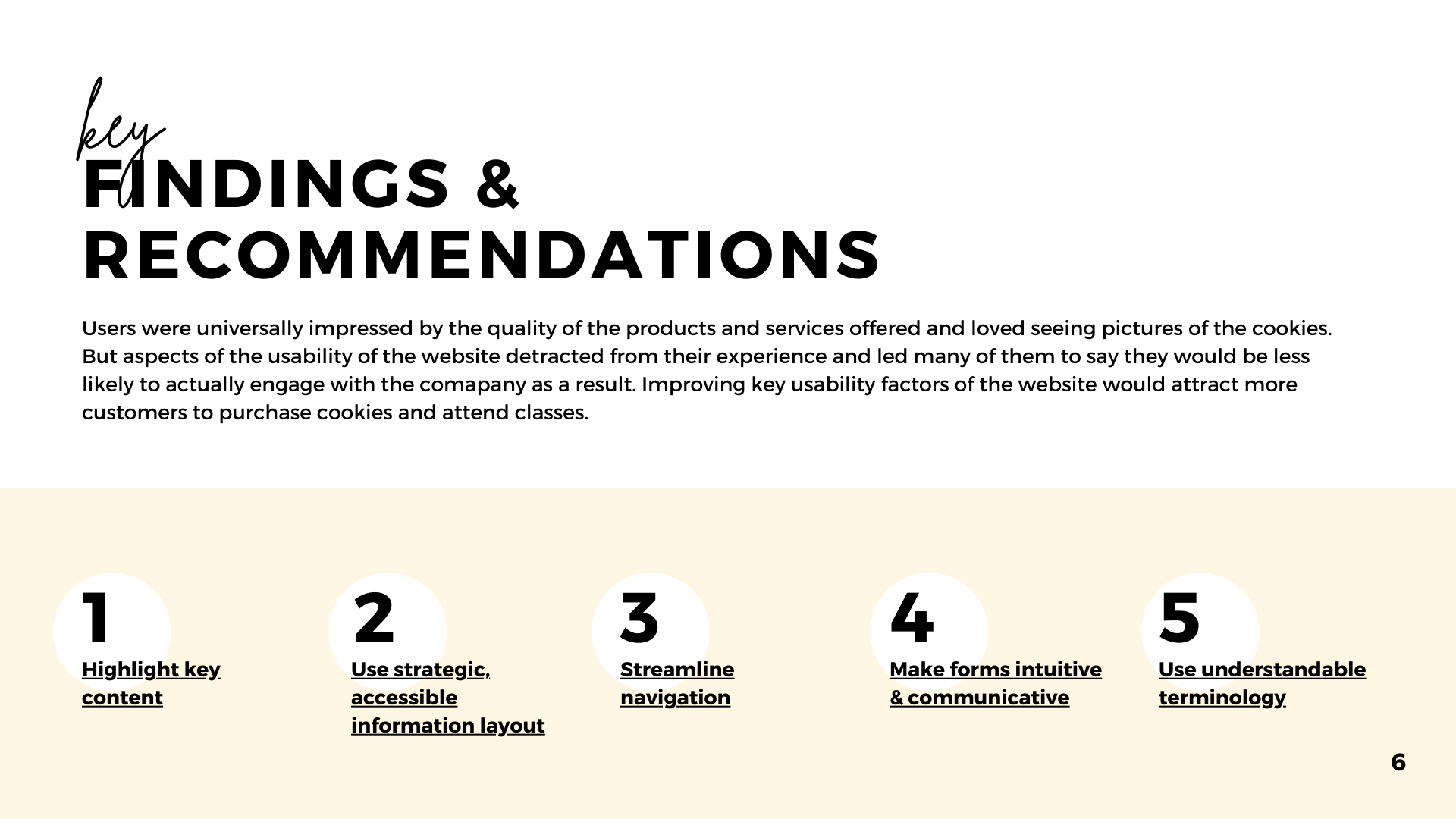
After completing user testing and synthesizing our results I found that in general, users were attracted to the products and services offered by Mau Loa Sweets, but they found the website somewhat uninviting and difficult to use. I grouped the issues of the site into categories, which I paired with 5 key recommendations:
Highlight key content - make sure the most important information to users is available right away on the homepage, and also highlight the most desirable elements on this landing page to attract users (e.g. cookie photos, a photo of the baker, the company values)
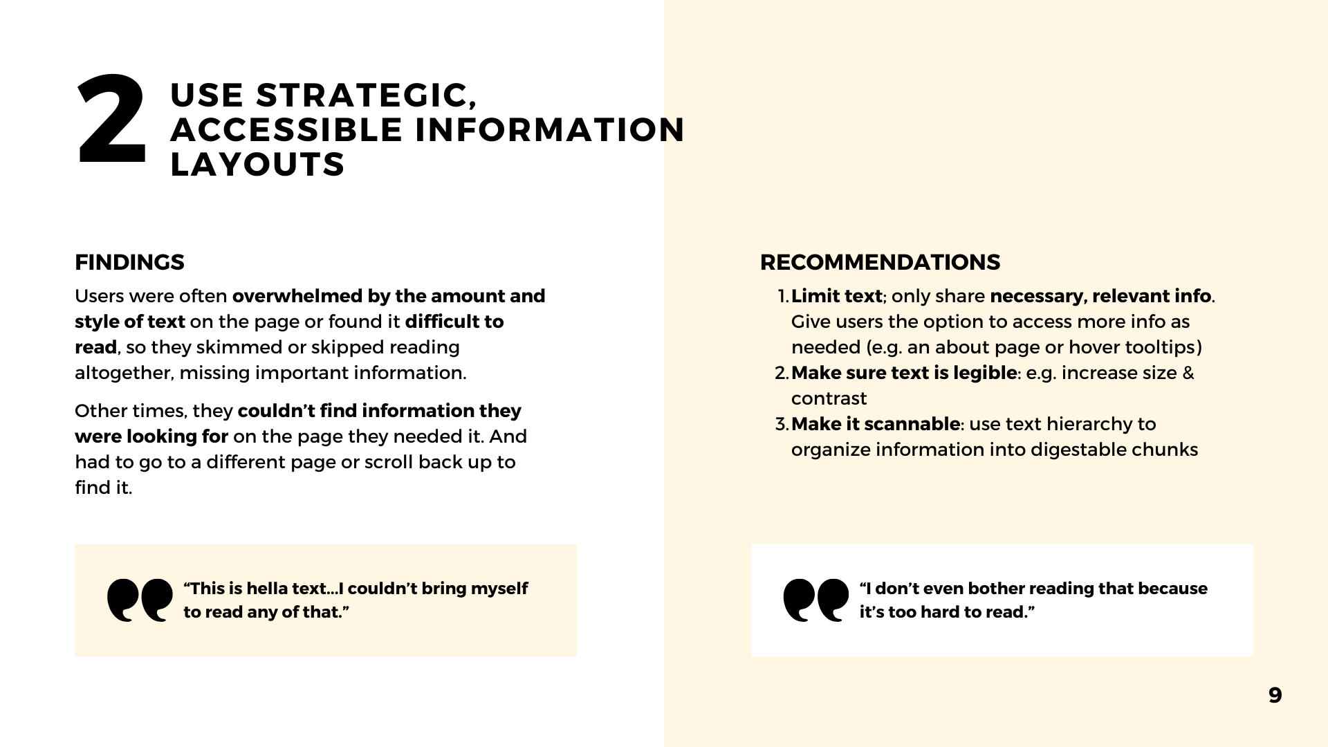
Use strategic, accessible information layouts - limit text to only relevant information, and make sure it’s displayed in a way that’s legible, with good hierarchy to make it scannable; store less immediately relevant information in places users can easily find it when they need to, like about pages and tooltips
Streamline navigation - redesign the navigation bar to clearly direct users to their key tasks, and make the navigation bar “sticky” to avoid having to scroll up repeatedly
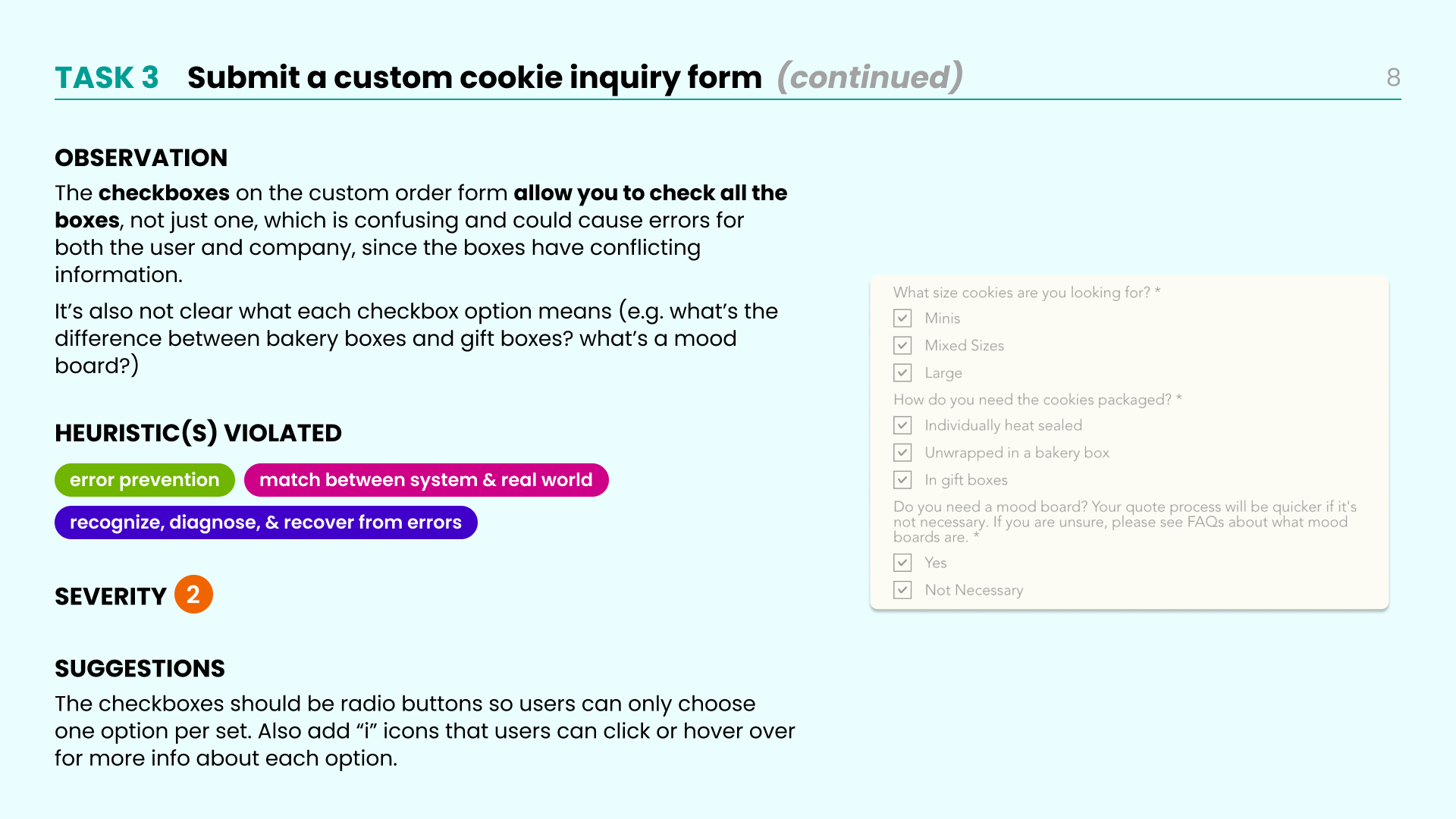
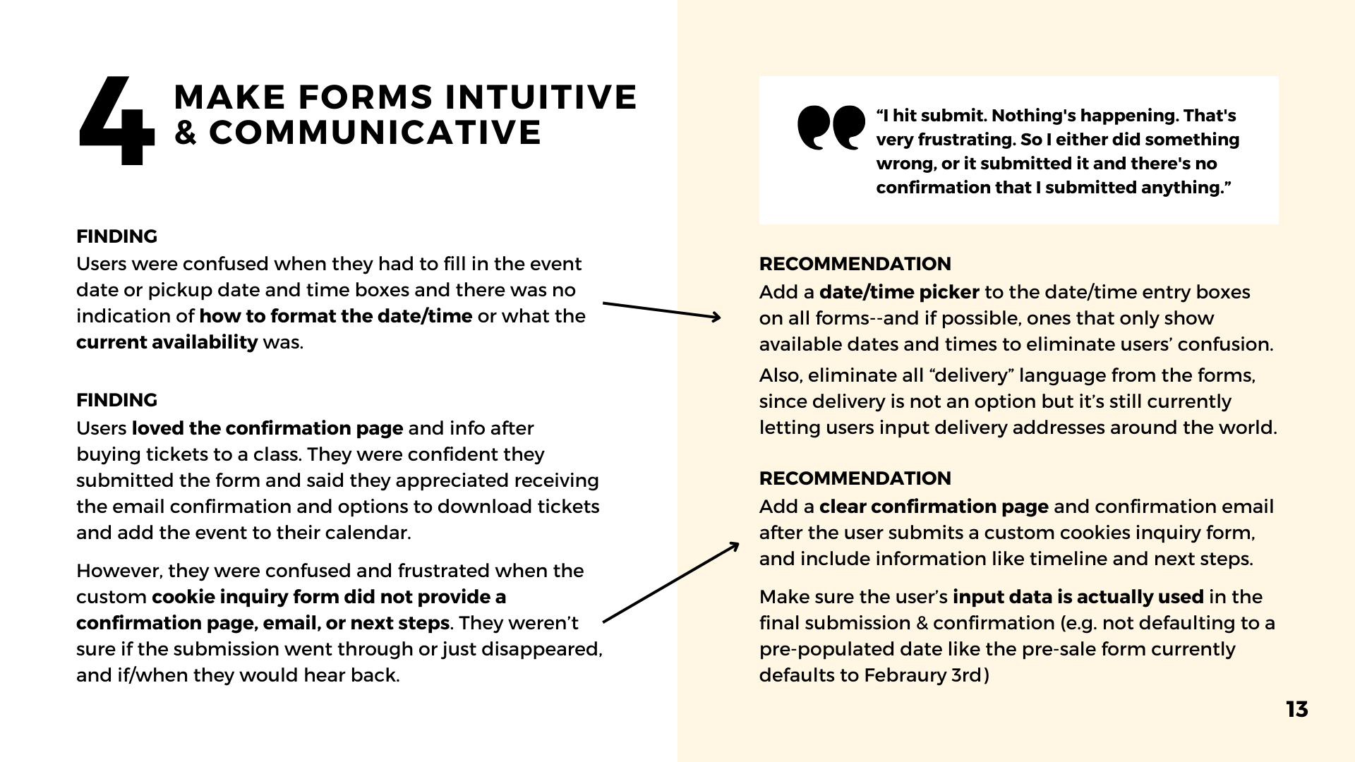
Make forms intuitive and communicative - add a clear confirmation page to the custom cookie order process, and add features to help users complete forms (e.g. date/time pickers that show available dates)
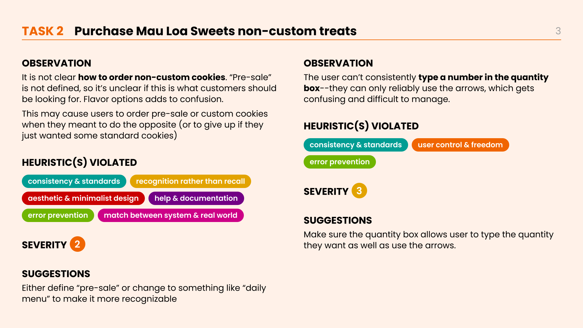
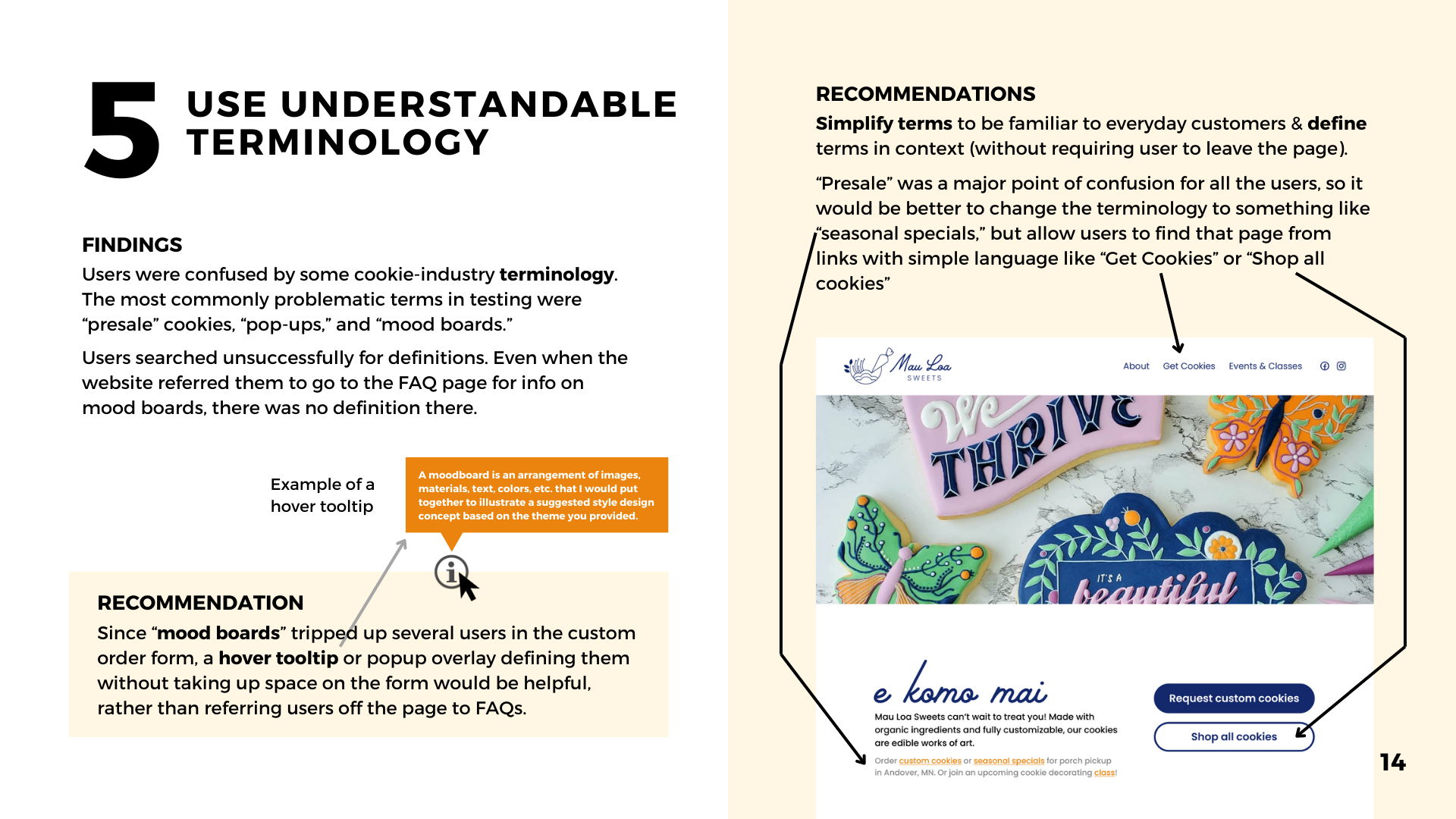
Use understandable technology - avoid or clearly define terms that are unfamiliar to average users, like “presale” and “mood board”
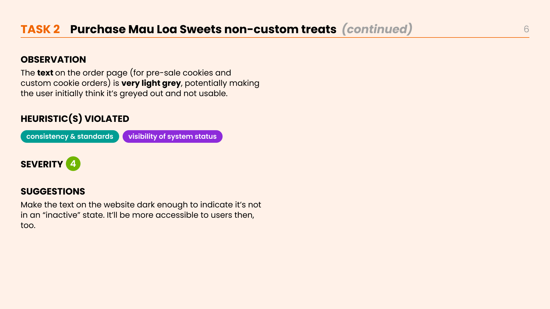
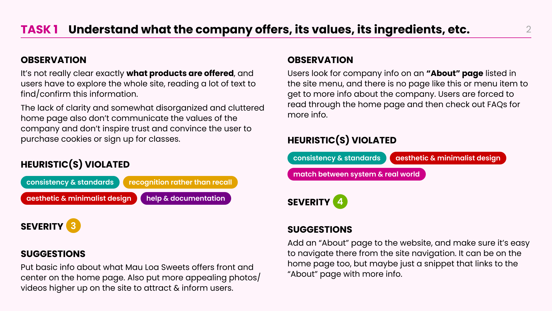
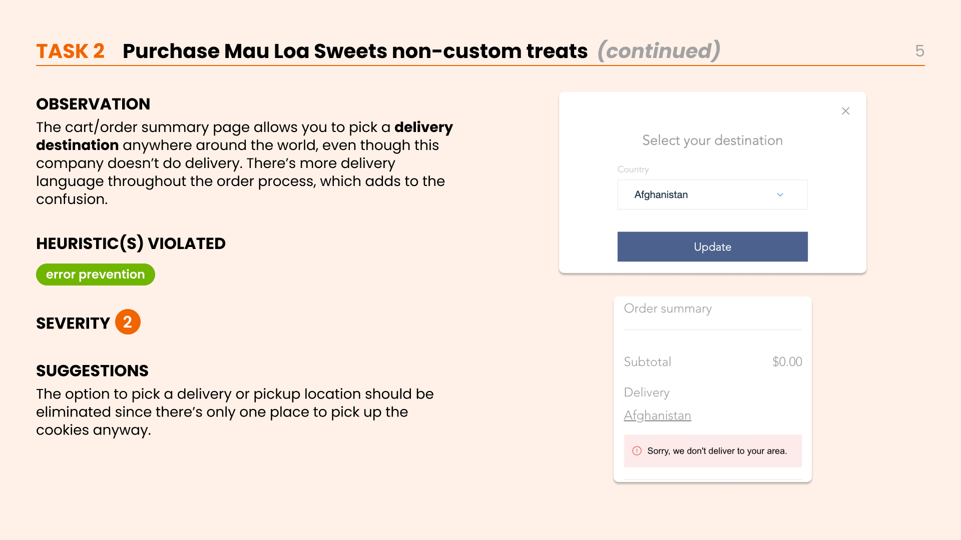
I provided this information to Mau Loa Sweets in a Findings & Recommendations report. Key slides from this report, along with specific recommendations, are shown below (click to scroll).
The Design
Creating a more approachable home page
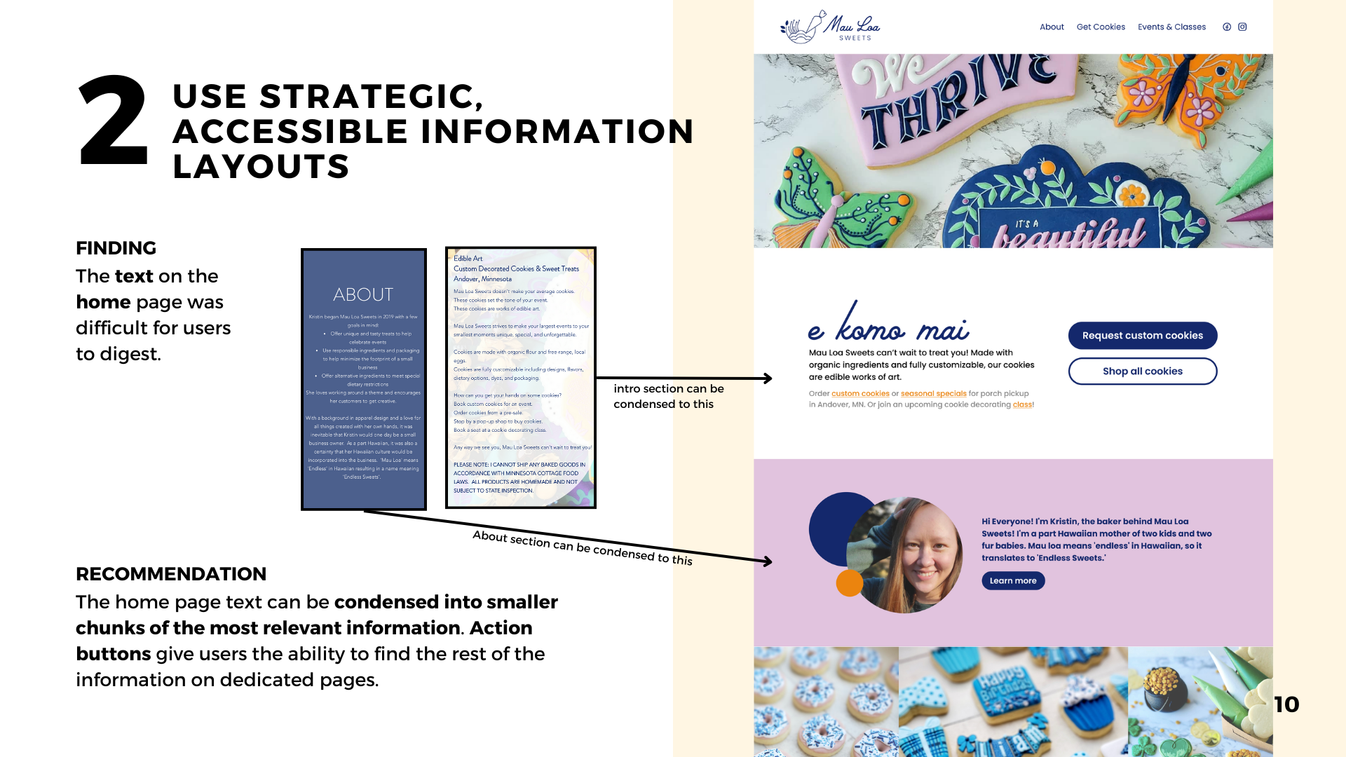
To demonstrate some of the recommendations I provided for Mou Loa Sweets, I created a basic prototype of the website’s home page, incorporating the suggestions I’d made. I provided this prototype in the findings and recommendations report I gave to Mau Loa Sweets.
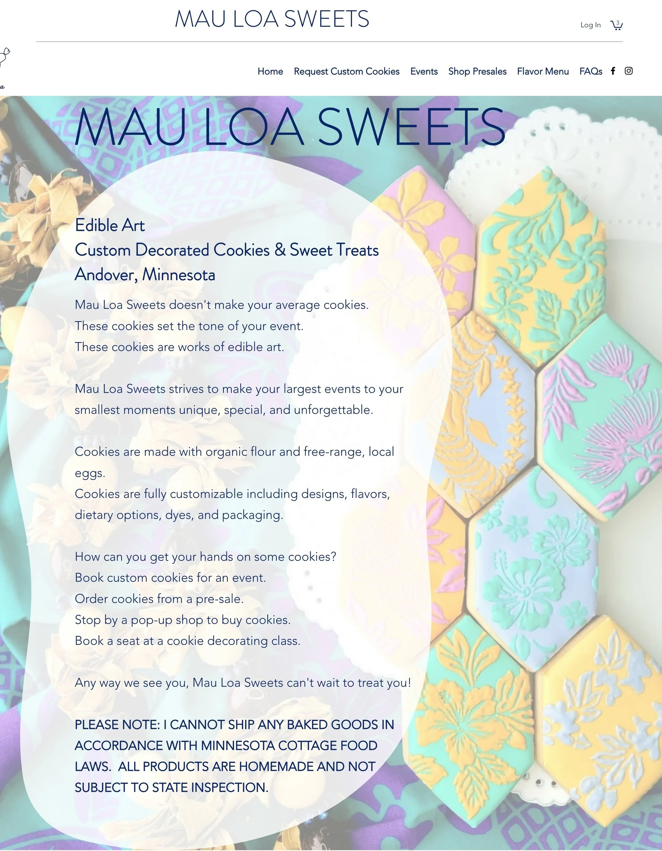
Original
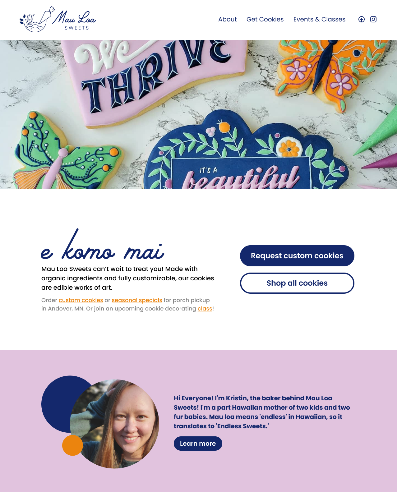
Selections from Mau Loa Sweets’ original homepage content - users found this difficult to read and tended to miss information as a result
I condensed the key information to be more readable, scannable, and approachable for users.
Part of my prototype of a suggested homepage layout, highlighting only the most important information and allowing users to click to read more
Prototype
Next Steps
Creating a new website
Given that Kristin is in the process of redesigning her website, it will be perfect timing for her to build in these usability recommendations to her new site.
Since the scope of this findings and recommendations report was more broad and focused on larger usability themes across the site, it did not necessarily encompass an exact reorganizing of the website with very specific recommended changes. So if I were able to continue working with Kristin going forward, I would start by proposing a reorganized information architecture for the website based on the data from user testing. I would then move into more specific recommendations for each page within that structure.
After an initial draft has been created, the website would benefit from iterative rounds of heuristic analyses, similar usability testing, and prototyping to compare the results and assess the effectiveness of the improvements.
Since I have already begun thinking through ideas for these next steps, I would be excited to continue working with Kristin to help her build out the Mau Loa Sweets website to better support her business and customers’ needs.

